Vaccine insights from English population-wide COVID/non-COVID deaths split by vaccination status/age
- Jeffrey Morris

- Jan 5, 2022
- 46 min read
Updated: Jan 14, 2022
Summary of Key points:
The UK ONS posted data on all COVID-19 and non-COVID-19 deaths in England from Jan1 through Oct31, 2021, split out by vaccination status and age group.
The vaccination status were unvaccinated, <21 days after 1st dose, >21 days after 1st dose, <21 days after 2nd dose, >21 days after 2nd dose. Note that it is explicit that unvaccinated ONLY includes those not yet given any shot, not 1-2 weeks after the shots.
The age groups were 90+, 80-89, 70-79, 60-69, 50-59, 40-49, and 18-39. This is an improvement from previous data that lumped all 10-59yr together in one group, leading to distortions from Simpson's paradox
The data were summarized monthly, and the posted numbers deaths per 100k, age-adjusted to the standard European population to further adjust for age-related bias.
I also added in plots showing the size of each vaccination group over time, to demonstrate the dynamics of the vaccine rollout that drive the makeup of the various vaccination groups and inform selection bias that explains unusual features in the data.
Strong vaccine effectiveness vs. COVID-19 death: The COVID-19 death data show major reductions of death rate in vaccinated than unvaccinated groups for all age groups, validating other results showing high vaccine effectiveness (VE) vs. COVID-19 deaths, corresponding to overall VE ~80-95% in the various age groups.
No broad increase in non-COVID-19 deaths after vaccination: There is no evidence of a general increase in non-COVID-19 deaths in vaccinated relative to unvaccinated. If the vaccines were inherently dangerous and causing high numbers of deaths (as some claim), we would see broad increases in non-COVID-19 deaths after vaccination, but we don't. In most scenarios, the age-adjusted non-COVID-19 death rates were equivalent or lower in vaccinated groups than unvaccinated groups, with two exceptions in specific circumstances, both involving small subsets of individuals with clear selection bias.
Higher death rates in young people receiving early vaccination: A specific high risk subset of the younger cohorts (18-39yr, 40-49yr) were selected out for early vaccination in mid-February, with the rest of their age cohort not eligible for vaccination until April, May or June. These included those with serious health conditions putting them at higher risk of death as well as health care and social workers, that for the 18-39yr old cohort would tend to be at the older end of the cohort and thus also having higher mortality risk. These high risk subsets were responsible for the higher mortality rates in February-March for <21 days after 1st dose, March-April for >21 days after 1st dose, for April-May for <21 days after 2nd dose, and for May-July for >21 days after 2nd dose. Because the general age cohorts did not receive vaccination until later, we can be confident these effects are in the selected high risk subset offered early vaccination, which for the 18-39yr group appears to have 2-3x the risk of the rest of the 18-39yr cohort but 4-5x lower risk than the next oldest 40-49yr cohort.
Higher death rates in "stragglers", the small proportion receiving first dose who delay or skip their second doses: In all age groups, we saw a spike of age-based non-COVID-19 mortality rates for the vaccination group >21 days after 1st dose precisely at the time point at which that age group first reached near-full 2nd dose vaccination. This tends to be a very small subset, ~1-5% of the cohort. This spike was of large magnitude, and tended to come down over time, but not completely to the unvaccinated level. Additionally, we saw similar spikes in the unvaccinated at the time when that age group reached near-full 1st dose vaccination. In spite of Neil et al. (2021)'s assertion these effects can only be explained by miscategorization of vaccine deaths as unvaccinated, it can also be explained by a potential death reporting lag artifact and/or inherent "straggler" selection bias based on the notion that those given 1st or 2nd dose long after the others in their age cohort may be dominated by those with medical complications that were either pre-existing or arose after 1st vaccine dose, and/or had recent SARS-CoV-2 infections. These will include any whose medical complications may have been vaccine-related, so is an important select subset to investigate further for potential vaccine-based minority harm.
Refutes claims of high numbers of vaccine-caused deaths: All together, these data show that it is not possible that vaccines are causing large numbers of deaths, and any vaccine-related deaths must be very rare cases of minority harm. Further, there is no evidence of excess deaths <21 days after 1st or 2nd dose, the time points containing nearly all VAERs death reports that drive the claims by Kirsch and others that there must be high number of vaccine deaths (1/500 vaccinated killed by vaccines). These data demonstrate these extreme claims are clearly implausible.
Vaccine rollout dynamics produce clear selection bias: Also, the vaccination rollout dynamics caused selection bias in certain vaccinated groups at certain time points, and these are the time points at which we sometimes see higher non-COVID death rates in some of the vaccinated groups than the unvaccinated groups.
Neil et al. (2021)' "adjusted" analysis reassigning unvaccinated deaths to vaccinated groups is unsubstantiated and inappropriate: These data fly in the face of Neil et al. (2021)'s claim that there is not substantial selection bias that can explain the irregularities in this data, and thus there must be widespread misclassification assigning vaccinated deaths to the unvaccinated groups. Given the ONS was very explicit that the unvaccinated group only included those receiving no dose, and included groups <21 days since 1st/2nd dose, there is no valid rationale for the "adjusted" analysis in Neil et al. (2021) in which they arbitrarily reassign unvaccinated deaths to vaccinated groups and draw conclusions based on this analysis. We show here that the vaccine rollout-induced selection bias can explain the irregularities in the data, and there is no reason to propose widespread misclassification that amounts to accusing the UK ONS of malfeasance or incompetence.
Introduction
In this blog post, I will plot, describe, and interpret new data from the UK Office of National Statistics (ONS) splitting out COVID-19 and non-COVID-19 deaths by vaccination status and age groups.
These rich population-level data provide a unique opportunity to assess how vaccination dynamics have affected patterns in COVID-19 and non-COVID-19 deaths, with the ability to account for dynamics missing in other more naive analyses based on self-reporting systems like VAERs or simple regression analyses of national death rates on vaccination rates that some have used to argue vaccines were killing people and/or not effective in preventing COVID-19 deaths.
While my primary focus will be try to simply interpret what the data seem to be saying, I will also consider their implications in evaluating two widely circulating claims about vaccine-caused deaths or low vaccine effectiveness in preventing COVID-19 deaths:
Some groups on social media are promoting the idea that vaccines are deadly dangerous, having "killed more than they have saved", and even suggesting they are killing 1 out of every 500 vaccinated based on their analysis of the USA open reporting system VAERs. I will evaluate what these population-level data tell us about the (im)plausibility of these claims.
Also, a recent preprint paper by a group of quantitative scientists (Neil et al. 2021) present an analysis of the previously posted UK ONS "deaths by vaccination status" data, from which they ultimately concluded that there is a large spike of vaccine-caused deaths at the beginning of vaccination and that the vaccines demonstrate no effectiveness in reducing the rate of COVID-19 deaths. These conclusions come from "adjusted" analyses in which they reassign all unvaccinated non-COVID deaths above the baseline life-table-based death rate to 1st dose vaccinated, and all 1st dose vaccine non-COVID deaths above baseline to 2nd dose vaccinated. This analysis is based on their assumption that there is no substantial selection bias changing the dynamics of the various vaccination groups, and thus any differences in non-COVID mortality among the vaccination groups is most likely caused by miscategorization of vaccinated deaths as unvaccinated. I will evaluate their conclusions and assumptions in light of these new data, as well, and in the conclusion provide a more thorough critique explaining why I think their analysis approach is inappropriate and conclusions unsubstantiated.
Introduction
A few months ago, the Office of National Statistics (ONS) of the United Kingdom posted national all-cause and COVID-19 death data split out by vaccination status and age group, providing a potentially useful data set for assessing how the UK vaccination program has affected deaths, and also serving as a check against claims that some have levied that there are large numbers of deaths for which vaccines are a causative or contributing factor.
I previously plotted and tried to interpret these data in blog posts, split in 4 parts:
There were some interesting insights from those data, but one key limitation is that the age groups into which the ONS split the data were limited to 80yr+, 70-79yr, 60-69yr, and 10-59yr.
The 10-59yr age group was problematic for numerous reasons:
The younger ones were not even eligible for vaccination.
The age group was far too wide, with 55-59yr olds having >50x higher mortality risk than the 10-14yr old groups.
The vaccination rollout was done such that the older members of the cohort received vaccination months before the younger members.
Given the posted data were not age adjusted, these factors together produced a strong Simpson's paradox effect that made it appear as though those fully vaccinated (2nd dose) had 2x higher death rates than the unvaccinated, causing some to claim these data were providing evidence of huge numbers of vaccine-caused deaths.
However, based on public data on background death rates and vaccination rates over time for different ages, in a previous blog post I showed that the distribution of vaccinated 10-59yr skewed so much older than the unvaccinated 10-59yr that one would expect ~2.3x higher death rate in the older vaccinated cohort than the younger unvaccinated cohort even if the vaccines had no effect on death rate. This suggested this entire difference could be more than explained by the differential age distribution between vaccinated and unvaccinated, inducing a Simpson's paradox artifact. I also put together a parody of this phenomenon, substituting "watching original vs. new Ghostbusters movie" for "vaccinated vs. unvaccinated" using the same differential age distribution to illustrate the silliness of causally interpreting results in the presence of such age confounding.
Newly Released Data on English Deaths by Vaccination Status for Narrower Age Groups
After receiving criticism for this broad 10-59yr age group, the UK ONS promised to release data on deaths by vaccination status split out into finer age groups. They followed through on this promise, and posted new data on the ONS website on December 20, 2021, for free download.
These data included all cause deaths, COVID-19 attributed deaths, and "non-COVID" deaths (computed by taking the difference) for England between January 1, 2021 and October 31, 2021, summarized monthly, and split out by vaccination status and age groups. I will highlight some of the details and key differences from the previously released data:
Monthly data through October: Note that the previous data set was summarized weekly and only covered deaths through week 38 (mid-September), early in the Delta surge. The new data include 5 more weeks, through the end of October (week 43), and is summarized monthly.
Vaccination Status: The following vaccination statuses were considered:
Unvaccinated
within <21 days of 1st dose
>21 days after 1st dose, no 2nd dose yet
within <21 days of 2nd dose
>21 days after 2nd dose
In the previous release, categories 4 and 5 were put together as "2nd dose", but here they are split out, which is useful to parse out some of the nuances in the data based on vaccination rollout dynamics.
Note that in spite of speculative claims on social media, including in articles by academic quantitative scientist (Neil et. al. 2021), people within 7 or 14 days of vaccination were NOT considered unvaccinated in these data sets. While at times when computing vaccine efficacy, only those 7 or 14 days past 2nd dose are counted as "fully vaccinated," this should NEVER be done for assessing vaccine-based adverse events (including deaths). In their vaccination group definitions, the ONS made it very clear that only people who have not received any vaccine dose are unvaccinated, and those within 21 days of vaccination are summarized in their own group, so there is no evidence whatsoever that this was done here.
There was not a separate category for individuals receiving boosters (3rd doses), but given that England just started its Booster program in late September and by the end of October only <10% of the English population was boosted, this should not substantially impact these mortality data. I assume any boosted individuals would count as >21 days after 2nd dose.
Age Group: The data were split into the following age groups.
90yr+
80-89yr
70-79yr
60-69yr
50-59yr
40-49yr
18-39yr
Thus, they split the previous 10-59yr age group into 50-59yr, 40-49yr, and 18-39yr. This is beneficial given the great disparities in pre-pandemic background death rates within this range:

I would still have liked to see them further split out the 30-39yr into their own age group given their substantially higher background death rate than <30yr, but these data are much better than the 10-59yr data in the original data set.
Also they did not include the 10-17yr olds at all in this update. I can see leaving out 10-11yr olds since they were not eligible for vaccination, but 12-17yr olds were, and they could (and IMO should) have been included in their own age group for completeness.
As we will see, splitting out the 40-49, 50-59, and 18-39 age groups will help elucidate particular vaccination rollout dynamics that lead to selection bias explaining some of unusual features in the non-COVID-19 death time series, and will also allow us to verify that indeed the 2x higher death rate in vaccinated than unvaccinated 10-59yr age group was a Simpson's paradox artifact driven by differential age distributions in vaccinated and unvaccinated, as I suggested here and here.
By the way, they also split the 80yr+ age group into separate 80-89yr and 90yr+ age groups, which enables a more fine evaluation of the dynamics in these very high risk groups.
Age-Adjusted Mortality Rates per 100k person-years
Besides the raw death counts, they also computed age-adjusted death rates per 100k person-years for each month/age-group/vaccination group along with 95% confidence intervals. This has several benefits by more precisely accounting for the vaccination group membership, adjusting for any remaining age confounding within the specified age groups, and providing precision estimates so we can see which numbers are driven by small sample sizes. Specifically,
By using person-years as the denominator, they were able to appropriately account for months in which an individual spent a fraction of time in one vaccination group and transitioned into another one.
Because it is person-years and not person-months, the rate is annualized, i.e. it indicates the rate of deaths for that group in a year, not a month. So, for example, a rate of 100 deaths per 100k person-years indicates 100 deaths per 100k people in a year, not a month. This is important if comparing the magnitude of these rates to other mortality data sets, including life tables.
The age-adjusted rates take the death rates within finer age strata (5-year groups, it appears), and then compute a weighted average of these to normalize each group to the 2013 European age distribution, a common standard used for mortality rates. This helps adjust for any remaining age imbalance among the vaccinated groups, especially within the 18-39yr age group, which helps correct for any residual age confounding and should prevent any age-based Simpson's paradox artifacts here.
Note, however, that this only corrects for age confounding -- it does not adjust for other potential confounding factors, e.g. by pre-existing medical conditions, sex, race, socioeconomic status, or temporal policy, vaccine rollout, behavioral, or viral dynamics, or previous infection status. These factors could still be imbalanced among the vaccination groups because of nuances in the vaccination schedules and varying mortality risks, resulting in selection bias that could still produce unusual artifacts in the data.
Also, the age-adjustment is not a panacea. Under certain conditions whereby the size of the age groups substantially vary over time, and if during times at which a particular age group is very small there is selection bias making the individuals in an age group non-representative of the total, this selection bias can be amplified by the age adjustment calculations and lead to its own distortions. This is one reason why it is important when plotting the data to somehow indicate the sample size of each age/vaccination group over time -- which I do by making the line thickness proportional to the sample size (in person-years, as described below) and including the 95% confidence intervals in the plots.
They also computed 95% confidence intervals for these age-adjusted mortality rates to convey the level of precision and uncertainty in the estimates. These intervals are very wide when the sample size for that group is very small and tighter when large, so the width of these intervals shows the level of uncertainty.
Here is the actual data set I downloaded from ONS:
This spreadsheet contains multiple tables, including the monthly counts of overall and COVID-19 deaths split out by age group and vaccination status, as well as overall age-adjusted death rates for the entire population for each vaccination group that they computed for COVID-19, non-COVID-19, and all deaths in Tables 1, 2, and 3. Here I will focus on the monthly data split out by vaccination status and the various age groups in Tables 5, 6, and 7, as I think this level of granularity is important to see some of the nuances in the data affected by different vaccination schedules and mortality risks across the various age groups.
With all of these public data, there is some measurement error and missing data, and the UK data is plagued by uncertainties in the total population numbers that can cause dramatic differences in the estimated number of unvaccinated that serve as the denominators for the unvaccinated mortality rates. This problem is well known and widely discussed, and all UK data, including these, must be interpreted in light of this uncertainty.
In this blog post, I will generate plots of these data that I hope are informative for people to investigate and interpret. Here are the R scripts I used to compute the plots:
A few details about the plots I generated:
I generated separate plots for each age group.
For each age group, to avoid the clutter of having 5 vaccine groups into the same plot, I split each age group into two plots: one containing the unvaccinated and <21 days/>21 days after dose 1 vaccination groups, and the other containing the unvaccinated and <21days/>21 days after dose 2 vaccination groups.
I computed separate plots for all cause deaths, COVID-19 attributed deaths, and non-COVID-19 attributed deaths.
Here I present, describe, and interpret the plots for COVID-19 and non-COVID-19 deaths.
Each plot shows the age-adjusted rate per 100k person-years, along with 95% confidence bands.
Given that the size of the vaccination groups vary dramatically over time, to demonstrate their relative size I made the thickness of the lines proportional to the number of person-years for that age/vaccine status/month, so thinner lines indicate smaller sample sizes and fewer individuals in that group.
Regions of the plots with very thin lines and wide confidence bands indicate very small groups with few individuals, and high levels of uncertainty in their mortality rate estimates, and also with greater potential for age-adjustment distortion. This is important for elucidating the vaccination rollout dynamics that are crucial in trying to interpret the data.
The ONS marks any month/age/vaccine group with <20 deaths as "unreliable" for estimating population death rates, so these are omitted from the plots.
I will present the plots in the following order:
COVID-19 deaths, first by older (>70yr) and then younger (<70yr) age groups.
Non-COVID-19 deaths for older (>70yr) age groups
Non-COVID-19 deaths for middle (50-69yr) age groups
Non-COVID-19 deaths for younger (18-49yr) age groups.
Keep in mind that these are observational data, and there are many key confounders not adjusted for (including pre-existing conditions, region, socioeconomic status, previous infection status, as well as temporal vaccination, behavioral, and viral dynamics, amongst others). As a result, it is not possible to directly draw causal conclusions about the effect of vaccination on COVID-19 and non-COVID-19 deaths from these data.
However, these are best data of this type to date, so I believe it is worthwhile to produce plots summarizing these data and describe their key features. I will also suggest some interpretations and explanations for some of the unusual features of the plots, but acknowledge that there could be other potential explanations for these effects as well.
Please feel free to critique my interpretations and provide your own interpretations in the comments below.
Age-Group Specific Vaccination Rollout
My primary thesis in the blog post is that many of the unusual features of the mortality rate plots, features an untrained eye would conclude indicate vaccine-related mortality, can be explained by selection bias based on details of the age-specific vaccine rollout.
Here is a table summarizing the UK Vaccine Rollout Schedule:

One thing to keep in mind is that the rollout was done by age, but those who were extremely vulnerable or had underlying health conditions were offered vaccination in January-February, possibly months before the rest of their age cohort. These people comprise a select high risk subgroup of each age group that, as we will see, will produce artifacts in the mortality plots. This will be especially evident in the younger age groups for which they were vaccinated many months before the rest of their age cohorts, and so dominate all the vaccinated cohorts for many months.
To further assist our analysis, I downloaded the publicly posted data of daily vaccinations in England through November 30 (https://coronavirus.data.gov.uk/details/download). found here:
From this, I processed these data to compute the number proportion of each age group in each vaccination status each day between January 1, 2021 and October 31, 2021. Here I share my R script for processing the data and generating plots for each age group in case you are interested in editing the plots:
As an illustration, here is the plot for the 70-79yr age group, from which you can see the main first dose rollout occurred in February, and the second rollout in May, and by June almost the entire cohort was vaccinated, with a small number of "stragglers" who either got first dose but not yet second dose, or did not receive their first dose at all. This type of plot helps us understand the makeup of each vaccination group over time to identify potential sources of selection bias.

The appendix at the end of this blog post contains the plots for all age groups with a detailed description of their characteristics.
COVID-19 Deaths Analysis
Here are the plots for the older groups, initially for unvaccinated and those after first dose:


And then with unvaccinated plotted against 2nd dose:


First, note that for the older groups, the COVID-19 deaths are dominated by a strong peak in January-February, corresponding to the winter surge dominated by the variant Alpha in the UK. The peak from the Delta wave in August-September is much lower, hardly noticeable in these older age groups. It seems Delta did not contribute nearly the number of COVID-19 deaths as the Alpha wave in winter 2020-21 for the older demographic. We can see measurable deaths in the vaccinated groups, but over time, the rate of COVID-19 deaths is considerably lower in the vaccinated groups than the unvaccinated groups. This corroborates the results suggesting the vaccines have high effectiveness in preventing COVID-19 deaths. If we compute the vaccine effectiveness vs. death (1 - ratio of age-adjusted death rate in >21 days after 2nd dose to unvaccinated) in August, we get 89.3%, 86.1%, and 74.1% for 70-79yr, 80-89yr, and 90yr+ groups, respectively. Here are the COVID-19 deaths for the younger groups, first comparing the unvaccinated and those given 1st dose:


And here are the plots of unvaccinated vs. Second Dose:


First, note that for the <70yr old group, we see two peaks in the COVID-19 deaths -- one in January-February as part of the winter surge dominated by Alpha variant, and the other in the late summer/early fall surge dominated by Delta. Unlike the older group whose COVID-19 death rate was high during the winter Alpha surge but much lower during the fall Delta surge, the younger age groups were strongly affected by Delta, with COVID-19 death rates just as high in the fall Delta surge as they were during the winter Alpha surge.
Many people have not noticed that there have been a relatively high number of excess deaths in young and middle age individuals in Fall 2021 during the Delta surge, driven primarily by COVID-19 deaths. The fact that COVID-19 mortality rate during the Delta surge was very low in the oldest groups at highest risk of death makes the total COVID-19 death numbers look low for Delta, but when stratified by age groups we see similar death rates from Delta as we did in the winter Alpha surge for these younger age groups. The number of COVID-19 deaths in the young and middle age groups during the Delta surge was substantial.
The fact that the COVID-19 death rate in younger age groups are (naturally) much lower than the older age groups causes many to not notice in times such as this even when it is high relative to the background non-COVID death rate for that age group. For example, a COVID-19 death rate of 15 per 100k person-years in the 18-39yr age group in August seems insignificant compared with the ~600 per 100k person years in 60-69yr, but when compared with the ~30 per 100k person-years background death rate in this group, it represents an increase of 50% in the age-specific death rate, so for that age group is substantial.
In the early months, the vaccination rates in these age groups were very low, so there were not many deaths in the vaccinated groups. In later months, we see more measurable levels of COVID-19 deaths but at much lower rates than unvaccinated groups, corroborating high vaccine effectiveness vs. COVID-19 deaths vs. the predominant Delta variant. The vaccine effectiveness vs. death of 2nd dose during the peak of the Delta surge in August was 80.3%, 89.8%, 94.3%, and 92.6% for 18-39yr, 40-49yr, 50-59yr, and 60-69yr age groups, respectively. This shows that while the COVID-19 Delta surge produced high excess deaths in the younger age groups, this was concentrated in the unvaccinated age groups, with very few COVID-19 deaths in the fully vaccinated.
Non-COVID-19 Deaths Analysis, >70yr Population.
The terminology "non-COVID-19 death" is a bit imprecise, since it is technically "deaths not attributed to COVID-19", and it is possible (and likely) that these include deaths were in fact caused by COVID-19 but not recorded as such on the death certificate. Thus, it is important not to strongly assume that ALL of these deaths were unrelated to COVID-19, as it could also include undocumented COVID-19 deaths as well as indirect COVID-19 deaths associated with COVID-19 surge dynamics such as overwhelmed hospital systems or hesitancy to seek medical care. As we will see, these data provide strong evidence the so-called "non-COVID-19 deaths" contain such deaths not documented as COVID-19 but directly or indirectly associated with COVID-19.
For the older population, first I will look at comparisons of non-COVID-deaths after 2nd dose with unvaccinated, and then look at deaths after 1st dose.


First, looking at the unvaccinated time series, note the high spikes in "non-COVID-19" deaths in January and February that coincide with the commensurate spikes in COVID-19 deaths and the known Alpha surge. This suggests that even these "non-COVID-19" deaths may contain many deaths that may have been due to factors related to massive COVID-19 surges, either directly via undocumented COVID-19 deaths or indirectly via poor or delayed medical care for non-COVID-19 issues that may have resulted from overwhelmed hospitals or individuals hesitant to seek prompt medical care for issues that may arise.
Since these spikes in unvaccinated deaths occur at the time when the vast majority of the age cohort has received 1st dose of vaccine, it is also possible that this spike is an artifact of a lag of 1 week or more in the reporting of death, the death reporting lag artifact phenomenon or an example of "straggler" selection bias effect in which those last to receive vaccine tend be have the highest risk of death. Both of these phenomena are described below.
Next, looking at the blue lines, we can see that the non-COVID-19 death rates within 21 days of 2nd dose started much lower than for unvaccinated individuals and remained below unvaccinated death rates throughout most of the time 2nd doses were being given, but then increased as the percent fully vaccinated approached 100%. Given >97% of the 80yr+ age group received 2nd dose by June and >97% of the 70-79yr age group received 2nd dose by May, this late increase corresponds to the last in their age group to receive 2nd dose. After this time, the small number of "stragglers" getting their vaccines late had higher death rates within 21 days of 2nd dose than unvaccinated. These involve very small sample sizes and very small numbers of deaths, as can be seen by the wide confidence intervals and thin Iines. There is certainly no evidence of increased death rates in the 21 days after receiving 2nd dose. Also, looking at the red lines, we can see that the non-COVID-19 death rates for those >21 days past 2nd dose were initially much lower than for unvaccinated during the winter Alpha surge, and remained much lower through the spring (In April, ~2x higher for 90yr+, >3x higher for 80-89yr, and 2.5x higher for 70-79yr) and summer (In June, 1.3x, 2x, 2.2x, higher in respective age groups), but this difference subsequently disappeared by October (1x, 1x, 1.25x higher in respective age groups).
These lower non-COVID-19 death rates have caused some researchers (Neil, et al. 2021) to speculate there is misclassification of vaccine deaths to unvaccinated, even effectively accusing the ONS of misrepresenting the data. But given the clear definition of the vaccination subgroups by the ONS, this seems unlikely, and they do not explain how such misclassification could have logistically occurred So what could explain these effects? Here are two possibilities:
Healthy vaccination bias: It is possible the healthier >70yr old individuals were vaccinated first, thus making the vaccinated group enriched for people at lower risk of death and the unvaccinated group enriched for people at higher risk of death. Over time, as more of the high risk group gets vaccinated, the difference dissipates. Neil et al. dismissed the potential of this type of selection bias to explain these effects. However, they limited their discussion on socioeconomic status, not considering pre-existing conditions and general health status, much stronger confounders that are more likely to be capable of driving this type of selection bias.
Undocumented COVID-19 related deaths: As mentioned above, non-COVID-19 attributed death does not necessarily mean non-COVID-19 deaths, as there could be numerous deaths not attributed to COVID-19 but either directly or indirectly caused by a COVID-19 surge. Given the prominent spike in non-COVID-19 deaths in January-February corresponding to the winter Alpha surge, it seems plausible this could be a substantial component of these totals. If this is the case, then some of the difference could be due to protective effects of vaccine vs. undocumented COVID-19 deaths. This possibility is dismissed by Neil et al. as they assume none of the "non-COVID-19" deaths could be related to COVID-19 but undocumented.
Neil, et al. (2021) are severely bothered by this disparity, which is why they posit the miscategorization explanation given they reject any selection bias or undocumented COVID-19 death explanations. I'm not sure I see why they are so concerned with this disparity. By the fall, this difference completely disappears in the 80-89yr and 90yr+ age groups, and nearly vanishes in the 70-79yr age group. Positing broad miscategorization without evidence, implying malfeasance or incompetence on the part of the ONS, is a strong accusation and unnecessary to explain these data.
Here are the plots for unvaccinated vs. first dose vaccinated:


First, looking at the blue lines, note that those within 21 days of 1st dose initially had much lower age-adjusted non-COVID-19 death rates than unvaccinated, and then these levels increased to match the vaccinated rates as the winter Alpha surge ended and a higher proportion of the cohort had received their first doses. There is certainly no evidence of increased mortality rates within 21 days of vaccination.
Second, as pointed out in the previous blog post, we see in all age groups a sharp uptick in the death rate in those >21 days after their first dose, and the peak level coincides with the time at which the proportion receiving their 2nd doses increased above 90% or so (June for 70-79yr, May for 80-89yr and 90yr+). In the previous blog post, I called these "stragglers" who are the subset of those given 1st dose who did not get their 2nd dose at the appointed time. These "stragglers" had much higher age-adjusted non-COVID-19 death rates (5x for 70-79yr, 4x for 80-89yr, 3x for 90yr+) than unvaccinated at the May-June spike, decreasing substantially by October but remaining greater than unvaccinated (3.3x, 2.25x, and 1.9x for the three age groups, respectively). As previously noted, the timing of this spike in deaths occurs when nearly all in their age group had received their 2nd dose. Here are the plots for the older age groups:


By the end of May, >90% of the 70-79yr, 80-89yr, 90yr+ cohorts had received its second dose, and only 1.5-2.5% were "stragglers" remaining in the >21d after 1st dose cohort. So we see these "stragglers" comprise a very small proportion of the total age cohort. So who are these "stragglers?" Neil, et al. (2021) claim that the only plausible explanation for these is that they are miscategorized deaths, that these individuals were in fact given second dose but mistakenly assigned to the ">21 days since 1st dose" subgroup. There are clearly other explanations. Here I mentioned two possibilities: a death reporting lag artifact, or a "straggler" selection bias effect.
Death reporting lag artifact
As demonstrated by Prof. Norman Fenton in a recent blog post, a delay of even just 1 week in death reporting can cause a large spurious spike of deaths in the unvaccinated cohort just at the time in which vaccination levels approach high levels (e.g. 90%), as the unvaccinated group gets very small and the time delay leads to inflation of the unvaccinated death rates. Here is a plot of this phenomenon from a simulation in his blog post of a fictional "placebo vaccine" with equal death rates as unvaccinated yet with a 1 week delay in deaths making the unvaccinated appear to have a spike of deaths right at the time the population approaches near full vaccination.

If there were a lag in death reporting in these UK ONS data, then this phenomenon could be coming into play here, with the ">21 days after 1st dose" playing the part of "unvaccinated" and the "2nd dose" playing the role of "vaccinated." The sharpness of the spike and precise timing at the point at which the "vaccinated" (i.e. 2nd dose) approaches 100% makes this very plausible. It is surprising that Neil et al. (2021) ignore this possibility, since Felton is a senior author on this paper and the one who has written the blog post describing this subtle artifact.
Of course, we don't have any evidence that there is any lag in death reporting, so this artifact may not be relevant here at all.
"Straggler" selection bias effect
A second possibility is that there is some sort of selection bias making the small number of "stragglers" a unique subset that have inherently higher risk of death. These stragglers would include any individuals given a first dose who subsequently had medical complications arise that made them delay or avoid getting their 2nd dose. It would also some who delayed 2nd dose because of COVID-19 infection after first dose. This seems to be a very plausible explanation here, more plausible than the miscategorization hypothesis promoted by Neil, et al. (2021) as "Occam's razor"
This group should be deeply investigated, since some of these could have had post-vaccine adverse events causing their medical complications. Before attributing all of these to vaccine, however, keep in mind that this group would also include any others with medical complications unrelated to vaccination that happened to occur between 1st and 2nd doses, which would not be such a rare occurrence in this older age demographic.
Regardless, it seems clear that this is a select subset of those given 1st dose with the highest risk of death. If you look at the 2nd dose plots in the previous subsection, the very thin blue lines in the summer indicate "higher than unvaccinated" death rates for the very small number of individuals vaccinated very later for their age cohort, who would be some of these "stragglers" at higher risk of death who finally received their second doses but died soon thereafter.
Non-COVID-19 Deaths Analysis, Middle Age (50-69yr) Population.
Thanks to the new UK data split out by 50-59yr and 60-69yr, we can thoroughly investigate the non-COVID death rate in middle aged groups.
First, I will plot the unvaccinated vs. 2nd dose data for these age groups.


First, looking at the green lines, the unvaccinated age-adjusted death rate increases in the springtime, with peak levels in April that are ~2.3x higher than they were in February/March. Looking at vaccination rates over time by age in England below, note that this peak occurs at the point after which the unvaccinated proportion becomes very small for these age groups (60-69yr at <10% and 50-59yr at 20-25% by mid-April).
Here are the vaccination plots:


Neil et al. (2021) claim the only plausible explanation for this spike is miscategorization of 1st dose vaccine deaths as unvaccinated deaths, but again it could be explained by the death reporting lag artifact or the "straggler" selection bias effects described above.
Also, the timing of these peaks corresponds to when one would expect a spurious peak in the unvaccinated group if death reports were lagged a week or so based on the simulations presented on Professor Fenton's blog post, via the death reporting lag artifact discussed above. We do not have any evidence that death reports are delayed in any way, so this spike might not be a result of this artifact.
Another possible explanation is the "stragglers" selection bias effect mentioned above, with the "stragglers" who got their first dose of vaccination for their age groups possibly being less healthy members of their age groups, and/or including those who had to wait for vaccination because of a recent SARS-CoV-2 infection.
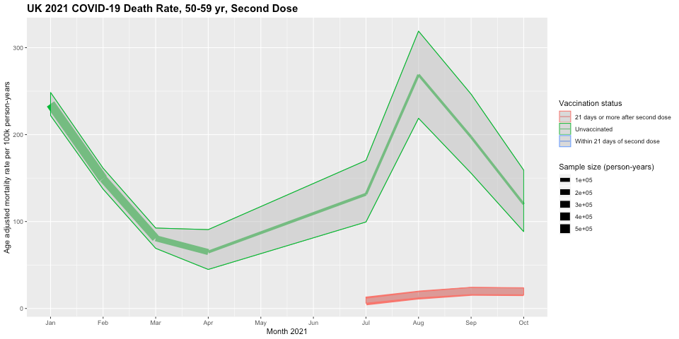
Second, looking at the blue lines, we see that the 60-69yr group showed similar patterns as the older groups, with initial age-adjusted non-COVID-19 death rates much lower than unvaccinated, but then in July by the time >95% had received 2nd doses, the "stragglers" receiving their 2nd dose late had increased death rates. We don't see this pattern in the younger 50-59yr age group, as the age-adjusted non-COVID-19 death rates are consistently lower in those within 21 days of second dose than the unvaccinated. There is certainly no evidence of increased mortality within 21 days of vaccination.
Looking at the red lines, those who are >21 days after their 2nd dose have lower age-adjusted non-COVID-19 death rates than the unvaccinated for all age groups. We do NOT see the 2x higher death rate in vaccinated and unvaccinated that appeared in the 10-59yr analysis at all, supporting my claim that this difference was explained by the differential age distributions in vaccinated and unvaccinated and an artifact of Simpson's paradox.
The non-COVID death rates in this group were considerably lower than unvaccinated in the late Spring (2.0x for 60-69yr and 3.1x for 50-59yr), but the difference was strongly attenuated by October (1.25x, 1.5x) but had not yet disappeared.
Now let's compare the unvaccinated to those receiving 1st dose of vaccine in these middle age groups.


First, looking at the blue lines, we see that the age-adjusted non-COVID-19 death rates in the first 21 days after receiving first dose were at similar or lower levels than unvaccinated. There is again no evidence of increased death rates within 21 days of vaccination.
Looking at the red lines, once again we see the vaccine group >21 days after 1st dose showed a spiked death rate in July, the time in which nearly all in the age groups had received their 2nd doses (>90% for 60-69yr and 85-90% for 50-59yr). These "stragglers" had much higher age-adjusted non-COVID-19 death rates (4.5x and 2.8x, respectively) than unvaccinated at the peak, and then decreasing somewhat by October.
As discussed above, this feature that Neil et al. (2021) suggest can only be explained by widespread death miscategorization could also be explained by the aforementioned death reporting lag artifact and/or "straggler" selection bias, given who did not get their second dose on schedule include those with health complications arising after receiving the first dose.
Again, this subset is important to follow up and track clinically since it may include some whose health complications were related to post-vaccination sequelae.
Non-COVID-19 Deaths in Younger Adults (18-49yr)
Finally, we consider the non-COVID-19 death rates in the young adult age group split into age groups of 18yr-39yr and 40-49yr. While there is still substantial heterogeneity in vaccination rates and inherent death risks within the 18yr-39yr age group, the use of age-adjusted mortality rates should account for much of the remaining age confounding and prevent any Simpson's paradox based artifact from showing up here, at least not based on age confounding.
First, we will compare the age-adjusted non-COVID-19 death rates after first dose vs. unvaccinated, starting with the 18-39yr age group.

First, looking at the blue line, we see that those vaccinated in late January/early February in the 18-39yr age group had non-COVID-19 death rates within 21 days of vaccination ~3x higher than the unvaccinated. This is a very concerning feature, given that it is well known and verifiable that the VAST majority of deaths reported to the USA open reporting system VAERs are within 21 days of vaccination. Thus, some will look at this feature as validation of VAERs data and corroboration of claims that the "vaccines are killing" many people.
However, if we consider this group, it is <5% of the total age group, and contains those who were offered early vaccination starting mid-February including all in this age group with pre-existing medical conditions that put them at high risk of serious disease or death, since the rest of the 18-39yr age group without preexisting health conditions were not even offered vaccination until May or June. It also includes health care workers who would tend to be in the older part (30-39yr) of this age range, and so having higher expected mortality than the younger in the cohort.
The red spike from March to May demonstrates that the "stragglers" from this select subset of early vaccinated who were >21 days after their first dose also had ~3x higher risk of non-COVID-19 death than the unvaccinated.
Clearly, this is a select group with known characteristics that make them inherently at higher mortality risk, so comprises a clear case of selection bias. If this spike in deaths was the result of vaccines being inherently dangerous and producing large numbers of deaths within 21 days of vaccination, then we would expect to see substantial deaths in May and June when the general vaccination in this age group commenced and the vast majority of this group received their first doses. However, there were only a total of 4 (11) non-COVID-19 deaths within 21 days of 1st dose in 18-39 age group in all of England in May (June), for a an age-adjusted rate of 8.1 (6.8) per 100k person years, which is 3x (5x) lower than the rate in the unvaccinated. The blue lines for these results do not show up on the plot because they are below the reliability threshold of 20 deaths in a month, but can be seen in the raw spreadsheet.
Thus, these data provide no evidence whatsoever of substantial numbers of vaccine-caused deaths in the 18-39yr age group within 21 days of receiving the 1st dose of vaccine. Thus, any claims that there are enormous numbers of vaccine-caused deaths within a few weeks of vaccination, as suggested by some people's analysis of VAERs containing the vast majority of deaths within 21 days of vaccination, are strongly refuted by these data.

We see an equivalent effect in the 40-49yr age group, for which the general vaccination did not start until April, but those with health conditions putting them at high risk of serious disease or death were offered vaccination starting in February. Thus, the higher rates of age-adjusted non-COVID-19 deaths within 21 days of first dose (blue lines) in February and March are highly likely to be driven by selection bias since they are occurring in the specific high risk subset of the 40-49yr age group offered early vaccination.
In the general vaccination starting in May, there was zero indication of vaccine-induced deaths in the <21days from first dose vaccination groups, with May having an age-adjusted mortality rate of 54.7 per 100k person-years, which is 4.3x lower than the unvaccinated age-adjusted mortality rate of 235.9 per 100k person-years, and only seeing a total of 6 deaths between June and October within 21 days of first dose for the 40-49yr cohort. Once again, these data strongly refute any VAERs-based claim that the vaccines are causing enormous numbers of death within the first few weeks after vaccination.
Looking at the red lines, the 2x higher age-adjusted non-COVID-19 death rates in those >21 days after 1st dose in March-April are the "stragglers" from among this early-vaccinated high risk subset who did not receive their 2nd dose on schedule. Given this cohort's inherently higher risk than others in the 40-49yr age group, this spike could also be explained by selection bias.
After general vaccination commenced in the 40-49yr age group (May) and the 18-39yr age group (June/July), there was an increasing death rate in those >21 days after 1st dose, "stragglers" not receiving their second dose on schedule, with ~3x higher risk of non-COVID-19 death than unvaccinated by October in both age groups. By October, 65-70% of the 18-39yr age group and 75-80% of the 40-49yr age group were vaccinated, so this spike in deaths corresponds to the same phenomenon we have seen in the other age groups.
Again, although Neil et al. (2021) would posit that these can only be explained by death miscategorization, it is also easily explained by the same death reporting lag artifact and/or "straggler" selection bias effects previously described. As emphasized above, this could include some individuals with medical complications resulting from post-vaccination sequelae, so is an important subset to follow up clinically to assess if there is any evidence of vaccine-related complications.
Finally, we will compare the age-adjusted non-COVID-19 death rates in those receiving 2nd dose of vaccine with unvaccinated in these young adult groups, first starting with the 18-39yr old age group.

First, note we do not see blue lines here corresponding to the age-adjusted mortality rates for those within 21 days of second dose except a single point in May. There were only a total of 53 deaths within 21 days of 2nd dose for the entire 18-39yr cohort between January 1 and October 31, and 44 of these were in April and May. Although based on small small sample sizes, these correspond to age-adjusted mortality rates of 49.1 and 47.0 per 100k person-years, respectively, which is 1.6x-1.9x higher than for unvaccinated,
Look at the 18-39yr vaccine rollout plot.

Given the general vaccination for 18-39yr olds did not start until May, all of these April/May deaths <21 days after 2nd dose would be in individuals who were given first dose starting February, including all in the age group who had pre-existing health conditions putting them at high risk of severe disease or death, the health care workers who tended to be in the older end of the age range with higher expected mortality, and on top of that, many of these are likely "stragglers" who did not get their 2nd dose on schedule. By the time the general 18-39yr age group started receiving their 2nd doses (June), the number of deaths within 21 days of 2nd dose was negligible (total of 9 in all of England from June to October). Once again, these data strongly refute any VAERs-based claim that the vaccines are causing enormous numbers of death within the first 21 days after vaccination, the time period in which the vast majority of VAERs death reports occurred.
From the red lines, note that in May through July, the age-adjusted non-COVID-19 mortality rate for those >21 days after 2nd dose was also considerably higher (2.2x, 1.8x, 2.0x) than for those unvaccinated. This paints a concerning picture, and the vaccinated 18-39yr olds' higher age-adjusted mortality rate creates the impression that the vaccines are inherently dangerous, perhaps "killing more than they save" for this age group.
However, once again we must consider the vaccination rollout dynamics. Given those in the general 18-39yr vaccination cohort did not receive first dose until May (30-39yr) or June (18-29yr), virtually all of the deaths in the May and June spike for >21 days after 2nd dose would have been from the select group of 18-39yr individuals who were vaccinated in the early February including those with serious health conditions, and in July the vast majority of those in the >21 days after 2nd dose vaccination group were in this select high risk subset. Once the general 18-39yr vaccination cohort started reaching the >21 days after 2nd dose, the difference decreased until by the time they dominated the select early vaccination cohort (September-October), the age-adjusted non-COVID-19 death rates in the vaccinated were back to the levels seen in the unvaccinated. Thus, the selection bias inherent to the early vaccination cohort is a major factor in this feature, and might even fully explain it.
Also, if we look at these death rates of this select early vaccinated subset of 18-39yr olds, while their death rates (in May ~55 deaths per 100k person-years) were much higher than the unvaccinated 18-39yr olds that exclude the early vaccinated cohort (In May ~23 deaths per 100k person-years), they are still much lower than the unvaccinated death rates for even the next older age groups (In May, 40-49yr age group >200 deaths per 100k person-years, 50-59yr old age >700 deaths per 100k person-years) . Thus, I am not proposing this early vaccinated group is a subset of 18-39yr olds who are on hospice or in imminent risk of death, but just one for which a subset have pre-existing conditions or being healthcare workers at the older end of the age group is sufficient to raise their mortality risk ~2-3x for their age group, but still 3-4x lower than the next older age cohort. Even such a mild degree of selection bias can make the relative mortality difference appear very large in these plots.
Given this selection bias and the fact that the differential mortality rate between the vaccinated and unvaccinated disappears one the general 18-39yr olds not in the early vaccination group dominates the >21 days after 2nd dose cohort, from these data, it is not clear whether there is any evidence that vaccines are causing excess deaths in this age group.

We see similar patterns for the 40-49yr old cohort as we saw for the 18-39yr old cohort, but less extreme.
We see from the blue lines that the age-adjusted non-COVID-19 mortality rate for <21 days after 2nd dose is higher in April and May when comprised of high risk individuals vaccinated early before decreasing substantially once the general cohort started receiving 2nd doses.
Also, the age-adjusted non-COVID-19 mortality rate for >21 days after 2nd dose is higher in May and June when comprised of the early-vaccinated high risk subset before decreasing substantially once some in the general cohort were >21 days past 2nd dose in July and August. However, unlike the 18-39yr group, although the mortality rates in the high risk early-vaccinated cohort were substantially greater than the general cohort, they were still less than the unvaccinated.
During the times in which most 40-49 received their 2nd doses in June, July, and August, the age-adjusted non-COVID-19 mortality rate within 21 days of 2nd dose was only 54.9, 41.8, and 28.3 deaths per person-year, respectively, which is 3.6x, 4.4x, and 5.6x lower than the age-adjusted non-COVID-19 mortality rates in the unvaccinated cohorts of 198.4, 183.7, and 157.4, respectively, and in this age cohort the mortality rate >21 days after second dose remained at lower or similar levels as the unvaccinated. Once again, these data strongly refute any VAERs-based claim that the vaccines are causing enormous numbers of death within the first few weeks after vaccination.
Conclusions
In this blog post, I have plotted, described, and interpreted the monthly age-adjusted COVID-19 and non-COVID-19 mortality rates for various vaccination statuses (unvaccinated, +/- 21 days after first dose, +/-21 days after second dose) for the different age groups (ranging from 18-39yr up to 90+yr) for England from January to October 2021 posted by the UK ONS.
This is the only data set of its kind, splitting out all cause and COVID-19 deaths by both vaccination status and age groups, and done for an entire population (England) for 10 months of 2021.
While noting the caveat that it is not possible to draw rigorous causal conclusions about vaccine effects on death from these observational data, there are still a great deal of insights that can be gleaned from these data, aided by the fact that age-adjusted mortality rates are calculated to adjust for any remaining age confounding remaining within the age groups. The granularity of the data in time, vaccination status, and age group make it possible for us to identify some of they confounders resulting in selection bias, helping explain some of the unusual features in these plots.
The age-adjustment helps adjust for any remaining age confounding in the data, but as mentioned above, it can introduce artifacts under certain conditions, especially during time periods for which the age/vaccination group is very small and subject to selection bias from factors other than age, which as I have shown here is a common occurrence in these data based on the vaccine rollout dynamics.
As a result, it is important to not overintepret regions in which the sample size is very small.
This is why plots include 95% confidence intervals and have line thickness proportional to the sample size of the given vaccination status/age group at that particular time, so we can see which time regions are based on substantial data and which are based on sparse data that could be subject to such distortions.
As I mentioned previously, there are confounding factors other than age not available in this data set that can strongly impact the data, most importantly co-morbidities and other health conditions that predispose some individuals for higher mortality rates, as well as previous infection status, which could both confer immune protection as well as increase the risk of co-morbidities from post-COVID syndrome.
There are many other caveats and limitations in these data that must be kept in mind, including the problem in estimating the denominators for UK data mentioned in the introduction, the lack of distinction between Pfizer and AstraZeneca vaccines, both given to roughly equal proportional of the English population but having substantially different efficacy and safety profiles, as well as time-varying factors like behavioral variables based on changing mitigation policies, the dominant viral variant at the time, or a seasonal factor -- these time-varying factors affect the vaccination groups differentially given that the vaccination rate changed substantially of the time range from January to October. There are others as well -- one must always keep in mind that there are many factors like these that make straightforward interpretation of observational data difficult, especially under such dramatically fluid conditions like the pandemic.
Given these uncertainties and limitations, there are many potential interpretations of these data. In this blog post I have given mine, but I acknowledge that others might have different explanations for the phenomena in these data. I encourage you to critique my interpretations and provide your own in the comments below.
The key insights I believe can gleaned from these data include:
Vaccine effectiveness vs. COVID-19 death: The age-adjusted rate of COVID-19 deaths is much lower in vaccinated than unvaccinated groups, providing corroboration of high vaccine efficacy vs. COVID-19 death during the Alpha and Delta variant waves. During the peak of the Delta wave in August, the 2nd dose vaccine effectiveness vs. death in England was between 80% and 95% for all age groups.
No broad increase in non-COVID-19 deaths after vaccination: There is no evidence of a general increase in non-COVID-19 deaths in vaccinated relative to unvaccinated. If the vaccines were inherently dangerous and causing many deaths, we would see broad increases in non-COVID-19 deaths after vaccination but we don't. Further, the lack of higher non-COVID-19 deaths in vaccinated subgroups refutes claims by skeptics that vaccine effectiveness vs. COVID-19 deaths are spuriously driven by COVID-19 death counts artificially attenuated by purported systematic lack of SARS-COV-2 testing of vaccinated in the hospital, since any such under attributing of vaccinated deaths to COVID-19 would result in a commensurate increase in non-COVID-19 deaths that is absent from these data.
In most scenarios, the age-adjusted non-COVID-19 death rates were equivalent or lower in vaccinated groups than unvaccinated groups, and there is no evidence of broad increases in non-COVID-19 deaths in the <21 days after 1st or 2nd doses of vaccine.
There were just two scenarios in which the data revealed higher age-adjusted non-COVID death rates in vaccinated than unvaccinated. In one scenario, the effect was clearly driven by known selection bias, and in the other scenario selection bias was also a potentially strong explanatory factor.
Selection bias in young people receiving early vaccination: A specific high risk subset of the younger cohorts (18-39yr, 40-49yr) were selected out for early vaccination in mid-February, while the rest of their age cohorts were not eligible for vaccination until April, May or June. These included those with serious health conditions putting them at higher risk of death as well as health care and social workers, that for the 18-39yr old cohort would tend to be at the older end of the cohort and thus also with higher mortality risk. These high risk subsets were responsible for the higher mortality rates in February-March for <21 days after 1st dose, March-April for >21 days after 1st dose, for April-May for <21 days after 2nd dose, and for May-July for >21 days after 2nd dose. Because the general age cohorts did not receive vaccination until later, we can be confident these effects are driven by the selected high risk subset offered early vaccination, which for the 18-39yr group appears to have 2-3x the risk of the rest of the 18-39yr cohort but 4-5x lower risk than the next oldest 40-49yr cohort.
Selection bias of "stragglers" given 1st or 2nd dose late for their age cohort: In all age groups, we saw a spike of age-based non-COVID-19 mortality rates for the vaccination group >21 days after 1st dose precisely at the time point at which that age group first reached near-full 2nd dose vaccination. This spike was of large magnitude, and tended to come down over time, but not completely to the unvaccinated level. Additionally, we saw similar spikes in the unvaccinated at the time when that age group reached near-full 1st dose vaccination. In spite of Neil et al. (2021)'s assertion these effects can only be explained by miscategorization of vaccine deaths as unvaccinated, it can also be explained by a potential death reporting lag artifact and/or inherent "straggler" selection bias based on the notion that those given 1st or 2nd dose long after the others in their age cohort may be dominated by those with medical complications that were either pre-existing or arose after 1st vaccine dose, and/or had recent SARS-CoV-2 infections.
Both of these select subgroups are worthy of further study and detailed investigation of their demographic characteristics and clinical course. The first involves many young adults with serious pre-existing medical conditions who are known to have substantially higher death risks than the rest of their age cohort. It is important to characterize what proportion of the early vaccinated group were indeed high risk, as opposed to being healthcare workers or social workers. Also, for the small number of these who died, it is important to characterize the clinical details surrounding their deaths, and to assess whether vaccination may have been a contributing factor, and if so to potentially adapt vaccination recommendations for this high risk group.
The second group containing those who received 1st or 2nd dose long after the rest of their age cohort is more mysterious, and careful delineation of demographic and clinical factors associated with these "stragglers" getting their vaccines late are needed to shed light on the underlying dynamics. The first-dose "stragglers" may have had a pre-vaccine medical condition that caused them to delay receiving first dose, or may have had recent SAR-CoV-2 infections. The second-dose "stragglers" are especially interesting since they tended to receive their first dose on schedule so had no apparent a priori reason why we would expect them to have a higher risk of death, yet somehow after 1st dose of vaccine it is clear that this select group has increased risk of death. This group will include any individuals who had medical complications arise after their first dose that caused them to delay receiving 2nd dose. For some of these, their complications may be related to serious adverse events after the 1st dose of vaccination, and as a result their deaths could be vaccine-related. Thus, detailed characterization of this cohort, its demographic and clinical characteristics, and the longitudinal clinical course for those who died, is crucially important.
In spite of the fact that there may be some potential vaccine related deaths, especially in these select sub cohorts, it is abundantly clear from these population data that the vaccines are not broadly dangerous in terms of causing widespread vaccine-related excess deaths. There is no broad pattern of excess non-COVID deaths after vaccination in any of the groups outside of these specific subsets. Any incidents of vaccine-induced deaths must be very rare, and cases of minority harm, not systemic danger.
I will conclude with some commentary of what I think these data say about some recent claims by other groups suggesting high levels of vaccine-induced mortality and/or low vaccine effectiveness vs. death.
Evaluating VAERs-based Claims of Enormous Vaccine-Induced Deaths
These data strongly refute the VAERs-based claims by Steve Kirsch and others suggesting the vaccines are “killing more than they save”; with his current estimates of 388k vaccine caused deaths out of 200m vaccinated, claiming 1/500 of vaccinated have been killed by the vaccine. It is clear from these population-level data that there is no way for there to be anywhere near this level of vaccine-induced deaths. In England with >40 million vaccinated by September 1st, his claims would translate to a proposed 80,000 vaccine-induced deaths.
Note that Kirsch's calculations are based on the death reports in the USA open reporting system VAERs, for which as he shows in his own blog post are almost entirely driven by reported events in the first few days after vaccination.

Thus, based on his calculations the vast majority of these purported 80,000 vaccine-induced deaths in England would have occurred within 21 days of vaccination. The fact that these ONS data show very few all-cause deaths during that time frame provide a strong refutation of his claims.
As highlighted elsewhere, Kirsch, like others making similar claims, can only get these estimates from VAERs data using methodology that is inherently flawed by not properly accounting for the background death rate in the vaccinated population, thus implicitly assuming nearly all VAERs death reports are caused by vaccine, and then extrapolating these up by his assumed >40x VAERs underreporting rate. In spite of these fundamental flaws and the specious arguments they produce, many forward his claims around social media as reliable estimates of vaccine-induced deaths that drive a major component of the vaccine hesitancy.
Evaluation of Neil, et al. (2021)'s interpretation of UK mortality data
These results are also hard to reconcile with Neil et al. (2021)'s ultimate conclusions that there is a large spike of vaccine-caused deaths in the beginning of vaccination and that the vaccines demonstrate no effectiveness in reducing rate of COVID-19 deaths. These conclusions come from their "adjusted" analyses in which they reassign all vaccinated non-COVID deaths above the background life-table-based death rate to 1st dose vaccinated, and all 1st dose vaccinated non-COVID deaths to 2nd dose vaccinated.
This reassignment was motivated by their suggestion that deaths within the first weeks after 1st dose of vaccination were mistakenly categorized as unvaccinated deaths, and deaths within the first weeks after 2nd dose of vaccination were mistakenly categorized as 1st dose vaccinated deaths. They suggested this miscategorization in spite of the fact that the ONS vaccine categories explicitly defined unvaccinated as "not yet receiving any vaccine dose" and specifically tabulated deaths "<21 days after 1st dose" and "<21 days after 2nd dose." It would take extreme malfeasance or incompetence on the part of the ONS to have miscategorized 14% of the deaths in this way, as proposed in their paper. That makes this a very bold accusation indeed, and the idea of explicitly reassigning a large number of deaths to other vaccine groups without evidence as their "adjusted analysis" does and then basing ultimate conclusions on this analysis approach is dubious at best.
They conclude that this miscategorization is the only explanation for these features in the data:
Spikes of unvaccinated deaths at the time when 1st dose vaccination was nearly completed for each age group
Spikes of deaths in those >21 days after 1st dose at the time when 2nd dose vaccination was nearly complete for each age group.
The non-COVID mortality rate in unvaccinated is higher than life-table death rates, and the non-COVID mortality rate in vaccinated is lower than life-table death rates.
This conclusion is strongly dependent on their assumption that there is negligible selection bias changing the dynamics and inherent mortality risk in the various vaccination groups. In Section 8 of their paper, they present results suggesting that any selection bias in terms of race, ethnicity, or socioeconomic status is not sufficient for explaining these features, and they quickly dismiss any suggestion these could be explained by selection bias from other factors including "more vulnerable people ... vaccinated first" or the >21 days after 1st dose containing "people too ill to receive their second dose becoming overrepresented."
These updated UK ONS data splitting out the younger age groups shows that indeed those in the younger age groups who were vaccinated in January/February are a select group with higher risk of death, and this explains the early spikes of non-COVID-19 deaths in the data, and nearly all the higher death rates in the vaccinated groups for the 16-39yr old cohort.
Also, our investigation of these data demonstrate that the spikes in mortality rates among unvaccinated occur at the time at which the vast majority of the age group has been vaccinated, and the spikes in mortality rates among the group >21 days since 1st dose occur at time when the vast majority have been given 2nd dose. Thus, these groups are exceptionally small, in many age groups only 1-2% of the cohort, and by definition these a select group that clearly includes some who remained unvaccinated because of current medical issues, and thus indicative of selection bias of some sort. It is also curious that Professor Fenton wrote an entire blog post introducing the death reporting lag artifact in the context of claiming it led to spuriously increased estimates of vaccine effectiveness vs. COVID-19 deaths, yet in this context of explaining non-COVID death artifacts in the vaccinated groups he and his co-authors completely ignore it as even being a possible explanation, instead preferring to propose a widespread miscategorization hypothesis and do "adjusted" analyses reassigning deaths to different categories willy-nilly.
It is not clear whether there was any delay in death reporting in these UK data, but in his blog post, Fenton shows a delay of even just 1 week in death reporting will produce a large spike in unvaccinated death rates right near the time point at which 80-90% of the cohort become vaccinated, the exact dynamic that is seen in unvaccinated cohorts when the age cohort approaches near full 1st dose vaccination, and in >21 days after 1st dose cohorts when the age cohort approaches near full 2nd dose vaccination. This is exactly the pattern they highlight in Section 4 of Neil et al. (2021) in Figure 12-14 to springboard into their claim of miscategorization and reassignment of unvaccinated deaths to vaccinated, and observed in every age group here, and yet they do not even mention Fenton's death reporting lag artifact out as a possible explanation.
They claim miscategorization of vaccinated deaths as unvaccinated deaths is "Occam's razor", the most feasible and really only plausible explanation, but I disagree. The vaccination rollout dynamics and patterns evident in these data suggest specific patterns of selection bias that are concordant with the data and population dynamics, and potentially explain the key features in the data.
To me, "Occam's razor" is that the data show vaccines have been strongly protective against COVID-19 deaths, that there is a no evidence the vaccines are broadly dangerous producing high levels of vaccine-induced deaths, but that there are small, select subgroups with high risk of death, including "stragglers" who delay getting vaccinated, that need to be carefully studied, with the subset of "stragglers" delaying second dose vaccination having the greatest potential of including cases of minority harm of vaccination. These groups should be thoroughly investigated. With the emergence of Omicron and its strong immune escape properties, we will need to collect more data to assess how these change vaccination dynamics and effects. But these data provide reassurance of the vaccine's effectiveness in reducing risk of COVID-19 deaths and a population-based refutation of claims of high levels of vaccine-induced deaths.
Appendix: Summary of Age-specific Rollout Dynamics and Characteristics:
Older (70yr+) Age Groups
Here are the plots demonstrating the vaccination rollout for the older age groups:
We see similar patterns for these three age groups:
The vaccine rollout for the 80yr+ age group and nursing home residents started on December 8, 2020, with ~25% already vaccinated as of January 1st. The 70yr+ group rollout started on January 18, along with any other "extremely vulnerable individuals."
The vast majority of the individuals in these age groups(90-96%) had received their first doses by mid-February.
The second doses started to ramp up in March, and the vast majority of individuals 70yr+ had received 2nd dose by mid-to-late May, with >90% of each age cohort given 2nd dose by the end of May.
As of June 1, only about 1.5%-2.5% of this age group had received first dose but not second dose, and 4.5%-5.5% remained unvaccinated. I refer to these as "stragglers" who delay receiving first or second dose beyond the rest in their age cohort.
Middle (50-69yr) Age Groups
Here are the plots demonstrating the vaccination rollout for the middle age groups:
The rollout for 65yr+ individuals started February 15, and 60yr+ March 1st, but those who were healthcare workers or were clinically extremely vulnerable individuals started vaccination in January. This was a sizeable group, >33% of the cohort by February 15.
The vast majority of the individuals in 60-69yr+ (>88%) had received their first doses by the end of March
The second doses started to ramp up in mid-April, and the vast majority (>80%) of individuals 50-59yr+ had received 2nd dose by the end of May.
As of June 15, only about 3% of this age group had received first dose but not second dose, and <10% remained unvaccinated. I refer to these as "stragglers" who delay receiving first or second dose beyond the rest in their age cohort. As of October 31, >8% remain unvaccinated.
The general rollout for 50yr+ individuals started March 17, but by then >49% of the 50-59yr old cohort had already been vaccinated. This includes healthcare workers and those with underlying health conditions putting them at higher risk of severe disease or death.
The vast majority of the individuals in 50-59yr+ (>80%) had received their first doses by the end of March
The second doses started to ramp up in mid-May, and the vast majority (>90%) of individuals 50-59yr+ had received 2nd dose by mid-June
As of June 15, <1% of this age group had received first dose but not second dose, and <15% remained unvaccinated. I refer to these as "stragglers" who delay receiving first or second dose beyond the rest in their age cohort. As of October 31, ~12.5% remained unvaccinated.
Younger (18-49yr) Age Groups

The general rollout for the 45yr+ started April 13 and for 40yr+ April 30, but by April 13, ~40% of the 40-49yr old cohort had already been vaccinated. This includes healthcare workers and those with underlying health conditions putting them at higher risk of severe disease or death.
The vast majority of 40-49yr+ (>73%) had received their first doses by the end of May.
The second doses started to ramp up in June, and the vast majority (~70%) of individuals 40-49yr+ had received 2nd dose by the end of July.
As of August 15, ~5.5% of this age group had received first dose but not second dose, and <22.5% remained unvaccinated. I refer to these as "stragglers" who delay receiving first or second dose beyond the rest in their age cohort. As of October 31, <3.5% still did not receiving 2nd dose and >20% remained unvaccinated.
The general rollout for the 30yr+ started May 26 and for 18yr+ June 19. However, by May 26, ~30% of the 18-39yr old cohort had already been vaccinated. This includes health care and social workers and those with underlying health conditions putting them at higher risk of severe disease or death.
The majority of 18-39yr+ (>60%) had received their first doses by July 15.
The second doses started to ramp up in August, and the majority of individuals 18-39yr+ had received 2nd dose by mid-August.
As of September, ~10% of this age group had received first dose but not second dose, and >33% remained unvaccinated. I refer to these as "stragglers" who delay receiving first or second dose beyond the rest in their age cohort. As of October 31, >6.5% still did not receive 2nd dose and >32% remained unvaccinated.
We can see that in this cohort, the vaccination really didn't take off until the summer and fall, and we were still in the midst of vaccination of the younger part of this cohort by October 31.
Thus, before September, the vaccinated groups were dominated by the early vaccinated, that because they contain those with underlying health conditions as well as the health care workers and social workers, who would not be evenly distributed among 18-39yr but concentrated in the older half of the cohort because of their required professional degrees. This makes this group subject to selection bias predisposing them to higher mortality rates whether vaccines had any effect or not.


wordle answer today This is an incredibly thorough and methodical analysis of the ONS data.
This is an incredibly thorough and methodical analysis of the ONS data. The level of detail in explaining how vaccine rollout dynamics create selection bias is really impressive, and the way you walked through each age group systematically makes it much easier to understand what is actually driving some of these unusual patterns in the mortality data. The "straggler" effect is particularly fascinating and seems like such a clear confounding factor that it is surprising it was dismissed by Neil et al. so readily. I recently saw a discussion on https://englandderbyshire.co.uk/ about the importance of data literacy in public health conversations, and this post is exactly the kind of careful, transparent work that helps people make informed decisions rather than…
This is an incredibly thorough breakdown of the ONS data! The detailed analysis of selection bias and the refutation of unsubstantiated claims are particularly insightful. It's reassuring to see how careful interpretation can clarify complex public health data. For another practical application of AI, check out AI Clothes Changer Online.
This is an incredibly thorough and insightful breakdown of the ONS data! The way you've meticulously addressed selection bias and refuted misinterpretations, especially concerning the "stragglers" and early vaccinations, is truly commendable. It offers much-needed clarity amidst a lot of noise. You can also gain Attractiveness Test insights there.
This was very helpful for me. I learned something new today. Please keep posting more content like this!” zoya khan